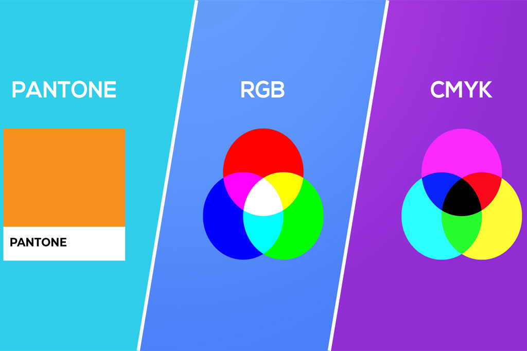
When it comes to printing your game, whether it’s board game components, card decks, or game boxes, choosing the right color mode is crucial for achieving the best visual outcomes.
The three most common color modes are CMYK, Pantone, and RGB, each with its own set of advantages and use cases.
This article will delve into the characteristics of each color mode and provide insights to help you decide which is better for printing your game.
Table of Contents
A Quick Comparison
Feature | CMYK | Pantone | RGB |
Type | Subtractive color model | Color matching system | Additive color model |
Primary Use | Printing on paper and other physical media | Standardizing colors for branding and manufacturing | Digital screens (TVs, computers, smartphones, etc.) |
Color Creation | Mixing cyan, magenta, yellow, and black inks | Predefined, specific ink formulas | Mixing light in red, green, and blue wavelengths |
Color Range | Limited by inks and printing technology | Wide range of specific, pre-mixed colors | Very broad, capable of displaying millions of colors |
Accuracy | Can vary based on ink, printer, and paper | Highly consistent due to standardized color formulas | Consistent on digital devices, but affected by screen calibration |
Benefits | Cost-effective for full-color printing | Ensures color consistency across different materials | Ideal for digital media, vibrant and dynamic displays |
Drawbacks | Color matching can be challenging without proofing | More expensive for printing, especially with many colors | Not suitable for print without conversion to CMYK or Pantone |
Applications | Full-color photographs, magazines, books | Brand logos, corporate identity, packaging | Web design, video, digital art |
CMYK
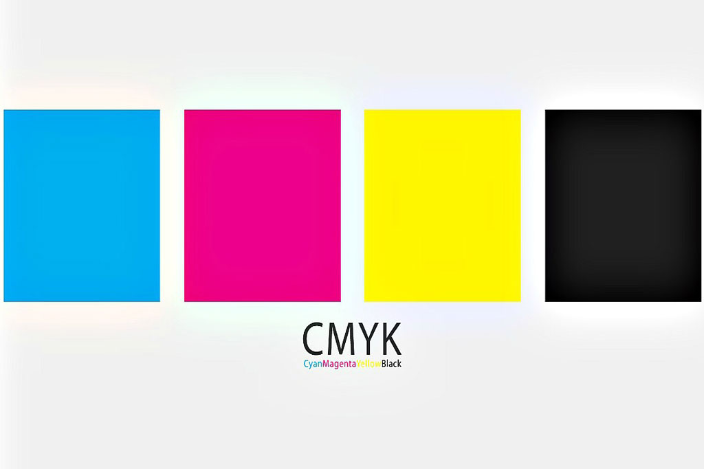
CMYK is a subtractive color model that combines cyan, magenta, yellow, and black inks to create a wide spectrum of colors. It’s the standard color mode for most print materials.
Pantone
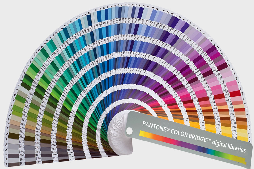
Pantone (PMS – Pantone Matching System) is a color-matching system that utilizes pre-mixed inks to attain exact color matches. It’s known for its ability to produce consistent and vibrant colors that might be difficult to achieve with CMYK.
RGB
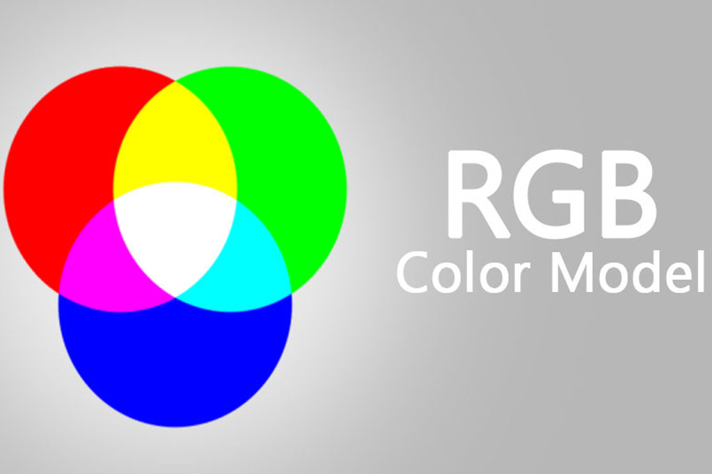
RGB (Red, Green, Blue) is an additive color model that creates colors by combining red, green, and blue light. While it’s not used for traditional printing, understanding its relationship to printed materials is essential.
How to Make the Decision
Project Type and Budget
- Use CMYK for most standard printing needs where cost-effectiveness and versatility are key.
- Opt for Pantone when your project requires specific brand colors, or you’re working with a limited color palette that needs to be consistent across all materials.
- Remember, RGB is primarily for digital purposes. Always convert to CMYK for printing, but be mindful of the potential for color shifts.
Color Expectations
- If your game design relies heavily on vibrant or unique colors that fall outside the CMYK range, Pantone might be the better choice.
- For general printing where color fidelity is less critical, CMYK will serve well.
Quantity and Scalability
- CMYK printing is more scalable and cost-effective for large runs.
- Pantone can increase costs significantly for large-scale projects with many different colors.
In Conclusion
The choice between CMYK, Pantone, and RGB depends on your specific needs, including color accuracy, budget, and the type of game materials you are printing. Understanding the strengths and limitations of each color mode can help you make an informed decision that ensures your game looks as vibrant and engaging in print as it does in the design phase.

